How do the opening and title screens of “Se7en” establish the film’s tone and themes?
The near-perfect early moments of David Fincher’s Se7en (1995) come in two forms: its three-minute expositional opening scene, and the brilliantly-crafted title sequence that follows. These two elements work in tandem to establish characters, set the tone of the film, create tension, and foreshadow events that are about to unravel all the way to its demented and shocking climax.
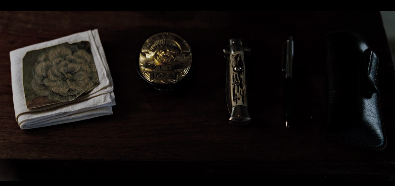
“Did the kid see it?” Somerset (Morgan Freeman) asks. He’s referring to a crime, and he’s asking because that’s the kind of guy he is. Somerset is curious and thoughtful, inquisitive and concerned. He’s been doing this job a long time, but he still cares about things like whether or not a kid sees something awful. Pair that question with Morgan Freeman’s contemplatively emotive face and the dreary backdrop of whatever city Se7en takes place, and we already have a pretty good idea of who this guy is. His badge, knife, gun, and handkerchief sit atop his dresser in a line, showing his meticulousness. A torn piece of wallpaper accompanies them, hinting to a curiosity that soon proves very real.
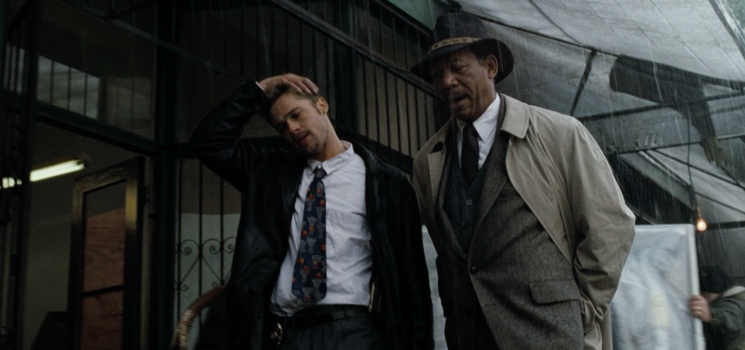
“Detective Somerset? I’m Detective Mills (Brad Pitt),” Mills says, barging into the scene to introduce himself. As we’re observing Somerset’s character through his behaviors and symbols, Mills jumps right in to tell us who he is. He’s been transferred in, and he’s ready to get to work. Old cop, young cop, detailed cop, brash cop. There’s a combative energy from the first time their eyes meet which invests the audience in their evolution.
“I wasn’t standing guard outside a Taco Bell,” Mills tells him. “I”ve worked homicide five years.”
“Not here,” Somerset assures Mills.
In a matter of seconds, characters and attitudes are established. Somerset sleeps alone, with only the meditative tick of a bedside metronome for company, and the credits start.
Too many films devalue the narrative potential of the credits, either rushing through them or not using them to any effect but slapping names on the screen. Perhaps that’s because too many viewers see it as a non-essential part of the film—time they can use to grab another bag of chips or refill their soda before the movie starts. But when properly used, a good title sequence can be just as effective at setting the pace of a film as any other footage. They can be as memorable as any acted scene that follows. Think about Saul Bass and the titles of North By Northwest (1959) and Vertigo (1958), or the disturbing ride through neurons firing lightning that introduced Fight Club (1999). Title sequences are the pinnacle of “showing, not telling” opportunity, which is one of the tenets of skilled filmmaking.
Se7en’s credit sequence is a masterpiece. On any list of “cinema’s best title sequences” you’ll find this entry, a grisly and artistic gem with uncanny attention to detail. It not only reflects the nature of the picture that follows, but unknowingly gives us our first glimpse of the man committing the film’s atrocities and his methodic dedication to crime, down to slicing off his own fingerprints with tiny razor blades. CreatieBloq says, “The maniacal amount of detail that went into the title sequence (with a vast amount of props created just for giving the audience a few glimpses into John Doe’s deranged mind), coupled with the remixed NIN track ‘Closer’, make you shift uncomfortably in your seat, anxious for what’s to be unleashed, and in one fell swoop it made title design cool and relevant again.”
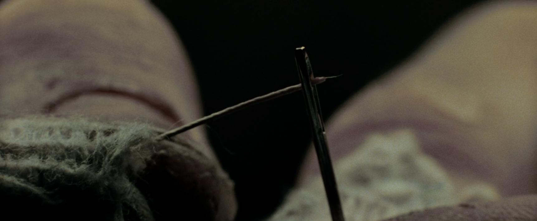
Se7en’s titles were directed by the great Kyle Cooper, known for directing over 150 title sequences for films like Donnie Brasco (1997) and Mimic (1997), as well as television shows like The Walking Dead (2010) and American Horror Story (2011). It’s a short story in itself, walking us through the mind and actions of a man clearly obsessed with religion and some sort of penitence. It’s that latter obsession that drives his killings and orchestrates his murderous chronicle.
Art of the Title describes it, saying, “It’s a sequence that has drawn comparisons to the grotesque photography ofJoel-Peter Whitkin and the experimental self-aware filmmaking of Stan Brakhage, and its format has been likened to Stephen Frankfurt’s title design for Robert Mulligan’s 1963 adaptation of the courtroom thriller To Kill a Mockingbird, which also features close-up photography of personal items to describe the psyche of one of the film’s key players. But it is more likely a convergence of unique circumstances and artistic vision that gave the Se7entitles their own distinct cadence, blending Fincher’s treatment of the film itself with Cooper’s visual interpretation of its narrative. And what ultimately distinguishes Se7en is its delivery, piecing together bits of leader and other film artifacts with ephemeral imagery and type etched right into the emulsion, all sewn together by Angus Wall’s staccato edit and Coil/Danny Hide’s nail-on-chalkboard remix of Trent Reznor’s industrial hit “Closer.” It’s an effortless presentation which — much like the killer’s diary featured within — wears its construction proudly on its sleeve.”
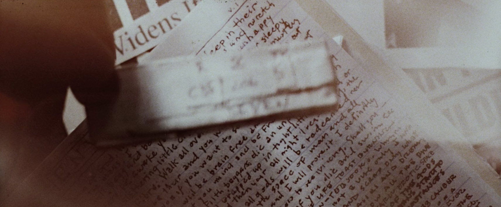
Cooper talked to Art of the title about his approach to the titles. He said, “When I was a kid and I would watch horror movies, the monster didn’t come out until the third act. I was lucky to watch [Se7en] early on, and I remember thinking that after I saw it, I wanted to see the killer earlier on… to somehow introduce the killer in the titles. I asked if I could look at all the props and anything that Fincher might have to look at, and there were a couple of prop notebooks that had excessive writing in them, and I thought it would be good to do a tabletop shoot with them and have it be about their preparation, as though it was John Doe’s job to prepare them.” He wanted to make it look like the killer himself was responsible for the title sequence.
Seeing the killer right away is a tease you’re not totally sure you’re getting. Only when John Doe (Kevin Spacey) shows up later in the film and his madness is truly exposed can you understand he’s the owner of the busy hands from the film’s title sequence, scrawling in his notebooks and cutting up papers and clippings.
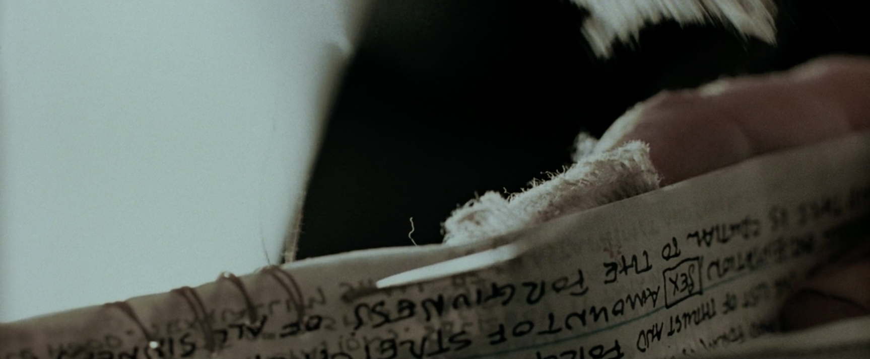
The title sequence’s hand-drawn typography is a cool effect, sure, but it also brings a personal element into the sequence. It’s like correspondence between the film and the viewer, or as the film would have it, between John Doe and the detectives he’s about to manipulate. By the end of Se7en, it’s clear the entire story was driven by Doe’s design. The scribbled typography mirrors the scribbles in his book, as if he’s writing down all the people he’s going to control over the next two hours. That, and the people who will watch him carry out his righteous plan of attrition. He’s a madman, but one who thinks he’s doing holy work. This is his passion, his calling, his purpose.
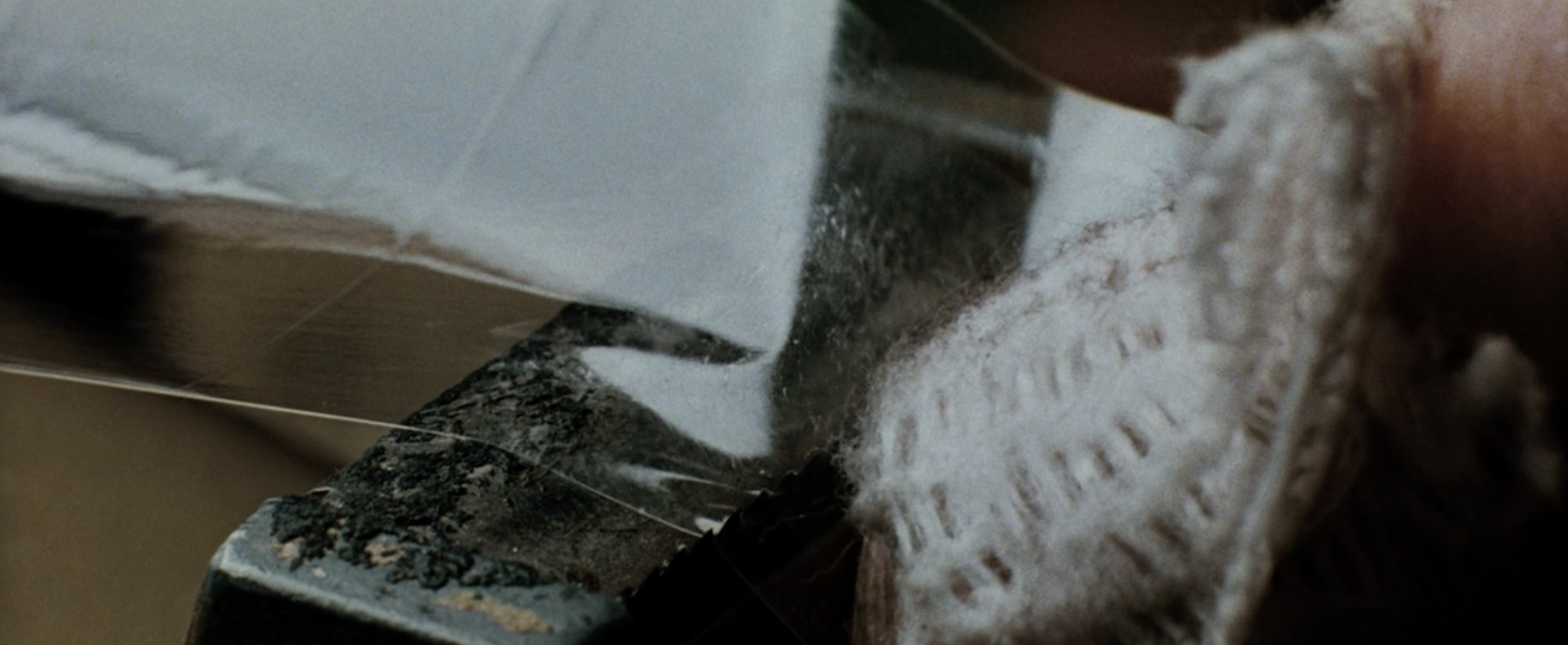
After all, the lyrics to Reznor’s song heard in the background are what end the sequence’s mini-narrative: “You get me closer to God.”
...of course, the line in the original song that precedes that one, which the sequence omits, is “My whole existence is flawed.”

